Saturday, May 28, 2011

Anime North Has Stupid Policies

Greetings, readers.

I just got back from AnimeNorth 2011, and boy am I upset. I dressed up as a ninja and I had two plastic swords with rounded edges (you couldn't cut anything with it). I was admitted into the Artist's Alley, yet wasn't allowed into the Dealer's Room, where all the merchandise is. This is the conversation:

Guy: "Sorry, we can't allow you in; you haven't gotten your weapon checked."
Me: "No one told me I had to get this checked. They let me in to Artist's Alley, why can't I go into this area?"
Guy: "You could poke someone's eye out with that."
Me: "Are you kidding me? You couldn't poke someone's eye out with this if you tried for a week! This is really lame."
Guy: "Yea, sorry, it's our policy."

I had to trek all the way across the building to the "weapons check area" where I had to sign 2 waivers, get my picture taken with the "dangerous weapons", and get them inspected by what they called the "Weapons Master"-----> fat, middle-aged dweeb. Guess what they did to ensure my "dangerous weapons" wouldn't poke someone's eye out. Give up? They put twist-ties on the handles. TWIST TIES! I couldn't believe it, especially since in the dealer's room people had booths selling real metal weapons! Real swords, throwing knives, one guy was selling girkha knives (curved knives used in WWI). I didn't see a single twist tie anywhere in those booths. That incident completely ruined my excursion and it enlightened me to how stupid some people can be.

Here's a picture of what a girkha knife looks like:


Here's what my 5 dollar plastic sword from Party Packagers looks like (try and find the magical twist tie):


Remember this dear readers, twist ties are your best form of protection.... according to the AnimeNorth Convention People.

Thursday, May 26, 2011

Blog Post#15-Tech Class Photoshoot

Greetings, readers!

In CyberArts Tech we've learned about different shutter speeds and apertures. For those of you who don't know what those are, shutter speeds are the amounts of time a camera's shutter is open and an apertures is a hole or opening in a camera that allows light to pass through. Our assignment was to go outside and experiment with different shutter speeds and apertures. Below are some examples of photos we took; they were meant to have obvious mistakes in order for us to learn which shutter speeds and apertures work best depending on the shots we want. My group was me and NightAngel.


This is shot that was over-exposed; that means too much light reached the film and any bright parts of the photo lost detail. Our subject, fellow CyberArtist I AM AWESOME's shirt is too bright and detail is lost. We made the f-stop too low; our next attempt shall be with higher f-stops. NightAngel took this picture in order to capture I AM AWESOME's love for dandelions.


This next shot was underexposed; not enough light reached the film so shadows became too dark and photo lost detail. The f-stop we used was too low. Also, the depth of field is off since the fence that was in the foreground became a transparent blur. We suspect the shutter speed was too fast and the camera was focused on the background too much. I don't know which of us took this shot.


These are our best depth-of-field shots. The transparent fence was on purpose this time; we wanted to focus more on the Mighty Machine digging up our football field. NightAngel took that one. The dandelion picture I took; I wanted to focus on the yellow flowers (do you call them flowers if they are weeds also?) and have the green grass a bit more blurry.

Blog Post #14-Edward Burtynsky

Greetings readers,

Have any of you heard of Edward Burtynsky? If not, he's a Canadian photographer who has become very well-known for his photographs of industrial landscapes. He was born on February 22 in 1955 in St. Catharines, Ontario. He has a BAA in photography and a diploma in Graphic Arts. Burtynsky's most famous photos show mining sites, mine tailings, quarries, factories, large industrial plants, etc. He captures them in such a way that they look almost natural and not man-made. He takes his photos with a large-format camera and 4x5 inch film, creating large finished products. In order to capture suitable shots, Burtynsky goes up on elevated platforms, the natural landscape, and sometimes on helicopters. His works have been exhibited in many galleries and museums across Canada and around the world. Below are some examples of his work:


Processing plant in China


Three Gorges Dam Project in China


Mine Tailing in Sudbury, Ontario

In 2006 a documentary was made about Edward Burtynsky called Manufactured Landscapes. The documentary focused on Burtynsky's many photograph series, his processes, and his inspirations for his photoraphs. It also showed the places he's traveled to in order to get good shots. I was enlightened as to the amount of destruction mankind has caused the environment in order to obtain resources that most of us take for granted. Seeing mine tailings that turned rivers bright orange or green and the humongous piles of rubber tires really opened my eyes. I think it's a really good thing that Burtynsky takes photos of places around the world that have been ravaged by man and abandoned, like the marble quarries in Italy that he photographed. Giant holes blasted into the mountains, and most of them were just abandoned. Oil spills were photographed as well, and just thinking of all the sea life that had to live with black gunk floating around makes me queasy. Thank you, Edward Burtynsky for inspiring us to help the environment!


Tuesday, May 3, 2011

Blog #13- Shazaam Project

Greetings, readers!

A project called Shazaam has just finished in CyberArts; it combines CyberArts with the force of Lakeshore Arts and Humber College. The project was to design propaganda posters advertising how great Lakeshore Collegiate Institute is since the school gets a pretty bad rap. Two guys came from Humber College to help us out with Photoshop and develop our poster ideas. We discussed topics like "family", "art" and "future" and made quotes with regards to those topics in order to finalize our ideas for our posters. I went with the theme "future" and my quote was "Lakeshore C.I.; our future is creative". The idea behind that is many years down the road in the far-off future, Lakeshore Collegiate will be the only school that survives. I didn't want to do a photo collage so I decided to just draw the whole poster in Photoshop. Before I began, I researched what old 50s posters of the future looked like so I would have some reference and inspiration. I wanted to make the lines smooth and very graphic; I tried to not have anything pixelated. Below is what the final product looks like:


In the background there's a futuristic city, depicting what the future might look like. The future Lakeshore Collegiate does not look like its present counterpart. I wanted the poster to be completely cool and futuristic; not the rectangular building it is now. If I was to rebuild Lakeshore C.I, I would try to make it look like that. To clear up any apocalyptic worries, I am not prophesying Lakeshore is going to be destroyed in the year 3000; I just chose that as a random date since it sounded cool. The school was really built in 1950; back then it was called New Toronto Secondary School. The hardest part of the poster was drawing the phoenix on the school since the feathers and the tail have to be flowing and feathery. At first the phoenix looked like a duck because I had made the wings look too lumpy and the head too duck-like.

Tuesday, April 19, 2011

CyberArts Assignment: Monster Chair


Greetings, readers,

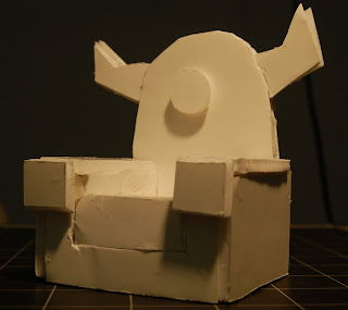
Just a few days ago in CyberArts, we designed our own chairs and built miniature models out of foam core. The chairs were supposed to represent ourselves in some way so I decided to make mine a monster chair (I really like monsters). If It was a real chair, it would be available in lots of bright colours since I like big bright colours. Below is part of the concept drawings I did to see how big the chair would be in real life and the different parts of it (so I would know how to make it with foam core). At first I wanted to do an eyeball chair or a squiggly alien chair but those would be hard to make out of foam core. For the concept drawings, we had to make grid drawings(orthographic) to show different sides of the chair (top, front, and side) and then a more detailed drawing (isometric) that could be three quarter view or otherwise.


When making the chair, I at first thought to use white tape on the outside but my friend suggested it would look messy if there was too much. I decided to use the glue gun since it can fit into cracks and dries very easily. I did end up using masking tape, but only a little bit on the inside of the chair where it would not show. The hardest part of making the chair was making the horns on the side of the monster chair's "head". I had to redo some of the pieces once or twice because I wasn't very good at making the pieces approximately the same size. Below are pictures of the monster chair from different angles.


When sitting in the chair, your feet would normally go on the floor unless you are a midget. The eye in the centre is a headrest for your head. I decided to make the chair pretty much an armchair that's been morphed with a monster so it would be functional still. I consider it a work of art because even though the monster chair looks like it is eating your face, it is still a comfortable chair.

Monday, April 18, 2011

Blog Post #12- Wacom Tablets

Hey blog readers!


Have any of you ever wanted to draw on the computer but had to draw with your computer mouse and the drawing ended up yucky? Lots of you? Oh no! Well, here's something that will completely change the way you draw on the computer! Drawing tablets! As you can see below, these are pressure-sensitive, flat-surfaced tablets that enable you to draw digital pictures just like you were drawing on paper. These tablets can cost as cheap as about $80.00 to about as high as $400.00. It all depends on how wide the tablets are and how good their quality is.


A good tablet type I like to use is the Wacom tablet(I'm not entirely sure what otehr types there are; this is the only one I know about). The Wacom tablet is smooth and has just the right amount of sensitivity. Plus, it's handy to carry around because it can be easily plugged into any computer's USB drive. If you get too large a tablet, it's best to keep that at home and maybe get a smaller one if you travel a lot.

Blog Post #11- Will It Blend

Greetings, readers,

Have any of you ever heard of the Blendtec blender? No? Well, the Blendtec blender is the best blender in the history of blenders! Why? Because it can blend anything! Tom Dickson, blender extraordinaire, stars in the Blendtec videos called Will It Blend. The videos show the Tom Dickson guy blending anything and everything, ranging from laser pointers to iPads-even silly putty! The hilarious thing is that during the videos, the cameraman will zoom out and it'll show the Tom Dickson guy with some big stupid grin on his face, as if he's saying "Isn't this fun? I'm blending a $499 - $829 iPad! Yay!"


The Blendtec company was really smart to make these videos because they make their blender seem like some unstoppable appliance. It's interesting to see how companies will try to get people to buy more of their products. This way is better than a TV commercial because if it's a TV commercial, people will just mute it or switch the channel. If it's an Internet video that advertises the product in an interesting way, then people will be more interested. If you are interested in seeing some old guy blend a bunch of stuff, here's a link to the Blendtec website! click here for blending bliss.