Wednesday, March 30, 2011

Chair Design In Sketchup- 20 Minutes

Hello everyone,

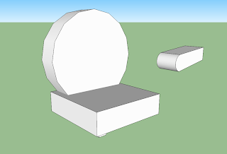
For a CyberArts assignment, we are designing chairs and creating miniature 3D models of them out of foam core. I designed a monster chair and below is an image of my first try modeling for 20 minutes on a software called SketchUp. It was a bit of a failed attempt; the software is a bit tricky trying to get all the shapes aligned. The back of my chair is curved and the curve on SketchUp didn't exactly fit the shape.

Monday, March 28, 2011

CyberArts Assignment: Romanticism

Lately, in CyberArts, we've been studying Romanticism, an art form that existed in the second half of the 18th century. It was prominently in Europe and emphasized drama and emotion in artworks. It focused on high contrast, composition, line, the majesty of untamed nature, emotions like horror, terror, and awe, and mythologies. The assignment was to create either a collage or a dry-point print (etching on a sheet of plexiglass, filling it with water-soluble ink, then pressing it on paper with a printing press), and make it have a Romanticism theme. I chose to do a dry-point print that focused on the majesty of nature and how small humans are in comparison.


The process work took a while because I was striving to make it look realistic and that was difficult to do in regards to line drawing. The composition I chose was diagonal because I wanted the viewer's eyes to be directed to where the tiny human in the artwork's eyes are looking towards. The final piece shows a small man standing on a bunch of rocks overlooking a lake surrounded by forest and mountains. The biggest problem I had (this affected my prints) was that there was so much detail that I didn't press hard enough in some areas. This caused the ink to rub off too much in some parts of the artwork and made it look a bit odd. The first print I did didn't turn out too bad. The second print I tried in colour, and the ink did not stick. The black ink transfered onto the paper but the blue I used for the sky and the green I used for the forest did not. The third print I did turned out not bad except parts were still hard to see. I used black and grey instead of colour.

Sunday, March 6, 2011

Blog Post #3: Video on Trial: The Good, the Bad, and the Outrageously Hilarious Music Videos

Greetings, fellow music video critics!

Have any of you watched or heard of Video on Trail? No? It's a program that critiques music videos; whether they suck, whether they rock, things like that. Today I'll be critiquing 3 music videos (the assignment was to do 2, but the 3rd one I found was too good to pass up). The first one features the song You Spin Me Round by Dead or Alive.This first video I consider to be quite bad. Unfortunately, the music video contains content from Sony Music Entertainment so you'll have to watch it on Youtube since it won't let me upload it to my computer.

Click Here For You Spin Me Round

This music video was made in the 80s (this could count for part of the reason why it is so weird and crazy). The main singer is dancing in a lumpy purple robe and gold scarf in half the video, and an all-black outfit complete with eyepatch the other half. His hair looks like he's been electrocuted on one side, and in part of the video he has 6 arms. All in all, a very strange music video that doesn't really pertain to the song except for the part where people are being tied up as they spin around. The song I like, the video, I do not.

This next video features the song Lollipop by Mika. This one is my favourite. For some strange reason, none of the videos uploaded properly so you'll have to click on the links if you want to see the videos.

Click Here For Lollipop

Lollipop by Mika was released in 2007, and it's one of my favourite music videos- it's animated, the animations are colourful and smooth, and the video makes sense when you hear the song. Sometimes I get bored watching live action music videos all the time so this was a refreshing change.

The third video is an outrageously crazy video. The song is Safety Dance by Men Without Hats and every time I see it I laugh really hard.

Click Here For Safety Dance

I think this video is honestly, totally crazy. I don't know why there are chicken masks, giant S's, and a midget playing a lute. This video is meant for laughs, in my opinion. I don't even get why it's called Safety Dance, and it seems the guy singing in the video kind of wanders around a bit in parts of the video.
Blog Post #2: MAGIX Movie Edit Pro Plus 17

Greetings, all promising movie editors!

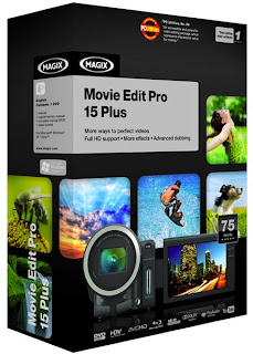
Just recently in CyberArts everyone was assigned to re-cut a movie/ video game trailer using sounds and music to change its genre using iMovie. iMovie seemed to limit my creativity too much so I hunted around and discovered a new movie editing software- MAGIX Movie Edit Pro Plus 17! It used to be an audio-editing only software, but recent versions have expanded it to video as well. It's not a very expensive software either, compared to others: $100. Here's a screenshot of the software in action (I found it uploaded on the website among others):


And here's a picture of what the package looks like if you want to buy it:


The thing I like best about this software is how much freedom you have with it. You can mess around with the sounds, fades, and video to your heart's content and it's not even that difficult to learn. The things I needed to know to make the Oliver Twisted trailer I found in the manual and in the Help section on the software itself. It's a software I would highly recommend for promising movie and sound editors.

Saturday, March 5, 2011

Blog Log (2011)

Inspired by fellow CyberArtist NightAngel, I've decided to post a Blog Log too (mostly due to my bad memory).

Tips & Tricks- 4/6

Personal Inspiration- 2/6

Artistic Inspiration- 4/6

Wild Card- 5/6

#1- Oliver Twisted recut trailer (Wild Card)
#2- MAGIX Movie Edit Pro Plus 17 (Tips and Tricks)
#3- Video on Trial (Wild Card)
#4- ZBrush (Tips and Tricks)
#5- Cinematographer (Artistic Inspiration)
#6- Don Martin (Personal Inspiration)
#7- Bobby Chiu(Artistic Inspiration)
#8- Sean Galloway(Artistic Inspiration)
#9- Cool Sidewalk Art ( Personal Inspiration)
#10- Graffiti Tutorial (Tips and Tricks)
#11- Will It Blend (Wild Card)
#12- Wacom Tablets (Tips and Tricks)
#13-Shazaam! Project (Wild CArd)
#14-Edward Burynsky (Artistic Inspiration)
#15-Tech Class Photo Shoot (Wild Card)

Wednesday, March 2, 2011

CyberArts Assignment: Big and Little Paintings

Greetings readers,

Not to long ago in CyberArts, a very interesting project was afoot. The project started with four giant pastels, then they turned into tiny croppings; these croppings became large pastels of the croppings. These large pastels then became large paintings, then the large paintings became small paintings. Below are photos of the large painting and small painting that I did:


Here is the large painting; as you can see, the goal was to be loose and crazy. Not much attention to detail here, but I feel that it turned out pretty good. It was interesting to not worry if you didn't paint it exactly to scale and to use large, flowing brushstrokes. A problem I had to overcome during this was covering up a spot of grey paint that somehow got onto the orange section. Four or five layers had to be applied before it was covered up. Another major problem was the tape border; it kept peeling off the board and brown paint managed to worm its way under it to ruin the border. Other than that, the large painting is probably my favourite because it was so much fun to paint. I would say the best section of that painting is the pink section at the bottom; the way the pink and white are layered on top provide good contrast. The area I would do over again if I could would be the brown section because it seems to lightly painted on compared with the rest of the painting.


This is the smaller painting; the goal here was to incorporate more details and to concentrate on getting smaller and more accurate brushstrokes. The smaller painting required more concentration because if a darker colour accidentally got into an area of the canvas with a lighter colour, multiple layers had to be applied in order to cover up any mistakes. Again, more gray spots appeared on this one and I had to apply more layers. A difficult part of this painting was adding light and dark to it. The original cropping was all one dull tone. I again enjoyed painting the pink section at the bottom because I could vary my brushstrokes more with pink and white. It doesn't look as good as the larger version in my opinion but I feel I did a pretty good job. The hardest part was painting the green. On paper, the green paint went on smoothly; on canvas, it went bumpy and jagged. The brush didn't flow as much on canvas and the result was jittery lines in areas.