Tuesday, April 19, 2011

CyberArts Assignment: Monster Chair


Greetings, readers,

Just a few days ago in CyberArts, we designed our own chairs and built miniature models out of foam core. The chairs were supposed to represent ourselves in some way so I decided to make mine a monster chair (I really like monsters). If It was a real chair, it would be available in lots of bright colours since I like big bright colours. Below is part of the concept drawings I did to see how big the chair would be in real life and the different parts of it (so I would know how to make it with foam core). At first I wanted to do an eyeball chair or a squiggly alien chair but those would be hard to make out of foam core. For the concept drawings, we had to make grid drawings(orthographic) to show different sides of the chair (top, front, and side) and then a more detailed drawing (isometric) that could be three quarter view or otherwise.


When making the chair, I at first thought to use white tape on the outside but my friend suggested it would look messy if there was too much. I decided to use the glue gun since it can fit into cracks and dries very easily. I did end up using masking tape, but only a little bit on the inside of the chair where it would not show. The hardest part of making the chair was making the horns on the side of the monster chair's "head". I had to redo some of the pieces once or twice because I wasn't very good at making the pieces approximately the same size. Below are pictures of the monster chair from different angles.
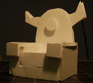


When sitting in the chair, your feet would normally go on the floor unless you are a midget. The eye in the centre is a headrest for your head. I decided to make the chair pretty much an armchair that's been morphed with a monster so it would be functional still. I consider it a work of art because even though the monster chair looks like it is eating your face, it is still a comfortable chair.

Monday, April 18, 2011

Blog Post #12- Wacom Tablets

Hey blog readers!


Have any of you ever wanted to draw on the computer but had to draw with your computer mouse and the drawing ended up yucky? Lots of you? Oh no! Well, here's something that will completely change the way you draw on the computer! Drawing tablets! As you can see below, these are pressure-sensitive, flat-surfaced tablets that enable you to draw digital pictures just like you were drawing on paper. These tablets can cost as cheap as about $80.00 to about as high as $400.00. It all depends on how wide the tablets are and how good their quality is.


A good tablet type I like to use is the Wacom tablet(I'm not entirely sure what otehr types there are; this is the only one I know about). The Wacom tablet is smooth and has just the right amount of sensitivity. Plus, it's handy to carry around because it can be easily plugged into any computer's USB drive. If you get too large a tablet, it's best to keep that at home and maybe get a smaller one if you travel a lot.

Blog Post #11- Will It Blend

Greetings, readers,

Have any of you ever heard of the Blendtec blender? No? Well, the Blendtec blender is the best blender in the history of blenders! Why? Because it can blend anything! Tom Dickson, blender extraordinaire, stars in the Blendtec videos called Will It Blend. The videos show the Tom Dickson guy blending anything and everything, ranging from laser pointers to iPads-even silly putty! The hilarious thing is that during the videos, the cameraman will zoom out and it'll show the Tom Dickson guy with some big stupid grin on his face, as if he's saying "Isn't this fun? I'm blending a $499 - $829 iPad! Yay!"


The Blendtec company was really smart to make these videos because they make their blender seem like some unstoppable appliance. It's interesting to see how companies will try to get people to buy more of their products. This way is better than a TV commercial because if it's a TV commercial, people will just mute it or switch the channel. If it's an Internet video that advertises the product in an interesting way, then people will be more interested. If you are interested in seeing some old guy blend a bunch of stuff, here's a link to the Blendtec website! click here for blending bliss.

Blog Post #10- Graffiti Tutorial

Greetings,

Are you looking to do some graffiti but don't want to get arrested? Then follow this link click here for part 1and watch this awesome tutorial! This link goes to part 2 of the TWOtorial (:D click here 4 part 2. The tutorial is done by some British guy who works for Photoshop Talent (I don't know if this is a real company or just that guy). The tutorial is all about how to create graffiti on Photoshop and then place it on a picture of a wall to make it look real. I found this tutorial extremely useful because one of the tech assignments I'm doing at the moment is on graffiti.
The thing I like about this tutorial is that it's very step-by-step. The guy whose narrating it makes sure the viewer understands what he's talking about (although he's got a heavy British accent so sometimes it's just difficult to even comprehend what words he's saying). I've seen other tutorials where the person just whips through it and isn't very clear with what buttons to press and which icons to click on. Hope you enjoy yourselves!

Blog Post #9- Cool Sidewalk Art

Greetings,

I've found an amazing Internet page that shows a whole smorgasbord of 3D sidewalk chalk works. They were all done by artist Kurt Wenner. The things I love best about them is how detailed they are and how the works seem so life-like. When looking at these pictures for the first time, I thought they were all paintings, not chalk. Kurt Wenner is a master street painter who creates the feeling of amamorphism(making his chalk art seem to rise and fall from the ground) by drawing mythical monsters from literature and theatre as well as historical pieces. Here is one of his pieces, called The Last Judgement. The Pope signed this mural!

The image below is another of my favourites (and a whole lot of other people's too because everyone likes money :P
I like how the vault opening looks 3D, even though, if you look closely, you can see the wall underneath. I like how Kurt Wenner uses the chalk to blend the colours together; that way viewers can't see the hard edges of the shadows. Kurt Wenner put a lot of detail into the picture and it's easy to see it took him quite a lot of time to do it.

Blog Post #8- Sean Galloway

Greetings readers,

Have any of you heard of the Tv show Spectacular Spiderman? No? Well, this post tells you all about the designer of Spectacular Spiderman-Sean Galloway! He is an artist who hails from Los Angeles, California. If you want to check out his gallery, go to his Deviantart profile at the following linkclick here. Sean Galloway is also working with the Schoolism online classes program so you can also check that out.


I like Sean Galloway's style because it's simple and really flows. Things like the edges of people's clothing and limbs all flow down to the next line. Another thing I liked about his artwork is the simple colours. They aren't flat, and they add a lot of detail to the drawings.

Since I also love drawing cartoons of super heroes, this style is really useful because it's not too difficult for the average high school student to draw when compared to the usual Marvel superheroes. Sean Galloway also likes drawing other superheroes and characters for fun so here are a few.

Sunday, April 17, 2011

Blog Post #7- Bobby Chiu


Bobby Chiu is a really good digital painter who works for Imaginism Studios. He's done a lot of digital drawings on dragons and monsters. He also teaches online digital painting at Schoolism.com. I like his artwork because I like drawing monsters and things like that too. It's neat to see the creative critters that Bobby Chiu thinks of, and how the dragons he draws are all different yet you can see some similarities in the way he draws them.

My favourites are these three photos that I uploaded, because I thought they were all really well done and they made me laugh. I like how the big red dragon is chasing the fuzzy white critter dressed up as a carrot. It was funny to see all these little creatures ganging up on a giant dragon that could probably knock them away easily. The blue dragon spotting the rubber dragon floatie was funny too, because it made me think of all the animals in the world who see people wearing clothes or something with their animal faces on them (for example, a raccoon seeing someone wearing a woolen raccoon hat) and probably wondering what is going on.

I recommend this link to all who want to see the rest of Bobby Chiu's works
http://www.imaginismstudios.com/our-art

By the way, Imaginism Studios did the art for Alice in Wonderland! Check out their website!

Tuesday, April 12, 2011

Blog Post #6: Don Martin

Greetings, readers,

Have you heard of Mad Magazine? It's a crazy magazine that makes fun of a lotta stuff! Heard of Don Martin? No??!!! He was an artist for Mad Magazine, and a very big inspiration for me. He died in 2000, but worked for Mad Magazine from 1956 to 1988. I love his cartoony style and the way he draws feet (if you ever see someone with feet like how Don Martin draws them, get them to a doctor quick!). A very interesting thing he did with his drawings was give them really big chins. Despite the big chins and floppy feet he was very good at caricatures of celebrities and famous works of art. Check out the Mona Lisa and American Gothic! Leonardo da Vinci must be spinning in his grave.


I like how he makes any sound effects really big and bright; they make the comic/cartoon a lot more zany and unrealistic. I've tried to incorporate some of his habits into my own drawings since what he does is very funny.

Blog Post #5: Cinematographer

Greetings,

A very interesting cinematographer I found out about recently is a foreign film director by the name of Tonino Valerii. Tonino Valerii has directed movies like My Name is Nobody, A Reason to Live, A Reason to Die, and other old movies from the 60s. My Name is Nobody, released in 1973, is a spaghetti western about a famous gunslinger who wants to retire but can't because of his biggest fan Nobody. The thing I like best about his movie My Name Is Nobody, is the movement of the background characters. Whenever the main characters are talking or something, the background is lively and very realistic (the extras aren't wandering around, unsure of what to do and where to go). Not only are the background characters spot on, but the camera angles are very interesting; there are plenty of closeups and strange angles used.


Below is the bar scene from My Name Is Nobody; concentrate not only on the background characters but also the different camera angles too. Even though it is an older movie, I still find it funny and interesting.

Monday, April 11, 2011

Blog Post #4: ZBrush


Greetings, readers,

A couple weeks ago I started a class learning the 3D modelling software ZBrush (either pronounced zed-brush or zee-brush). Surprisingly, this software is used in a variety of movies like Avatar, Watchmen, and Pirates of the Caribbean. The main reason ZBrush is so popular is because it's like creating models with digital clay (if you do not have a tablet, you won't be able to experience the full controls and attributes of the program with a regular mouse). If you want to, you can also do 2D models but they do not have as many features and capabilities.


When you open the program, a sphere is already selected for you to alter. If you don't want to use the sphere, click on the squiggly yellow shape at the top right hand corner to select a different shape. Remember this, if you select a new shape, remember to click "Make Polymesh 3D" in the top right hand corner or else you can't model on the shape. The images are all things you can do on ZBrush(I haven't gotten that good yet- stick figures are all I can manage right now).